GWR Parcels & Receiving Office
This Parcels & Receiving Office was built as part of a larger diorama and is nestled in between a Hotel on one side and a high brick wall on the other. All of these structures are low-relief and only about 25mm deep. The prototype for this office existed at one time around Paddington but the GWR, along with all major pre-Grouping railway companies had Receiving Offices in all major towns and cities up and down the country. As they were sited away from an actual station, they quite often took the opportunity to advertise their railway in very elaborate style. Therefore the scope to produce a model which conveyed some of this atmosphere was an enticing prospect
There are several aspects I love about Victorian and Edwardian architecture, and railway architecture in particular. Specifically, generous proportions and their love of well-balanced and well-proportioned detailing, along with a confident use of colour. Their railway architecture and engineering just oozes the sense of prowess and all-conquering confidence that came with knowing they were world-leaders at most things at the time. Buildings such as the subject of this article seem to be condensed versions of all this confidence; using colour and contrast to best advantage plus a number of different building materials and finishes. In researching the model, I had to rely heavily on input from a friend of mine, far more knowledgeable than me about all things Great Western as my forte is the Midland Railway. So there were endless emails back and forth asking about colours of doors, door frames, windows, stone-work, signage, etc etc. The list at the start seemed endless but I think we got there in the end!
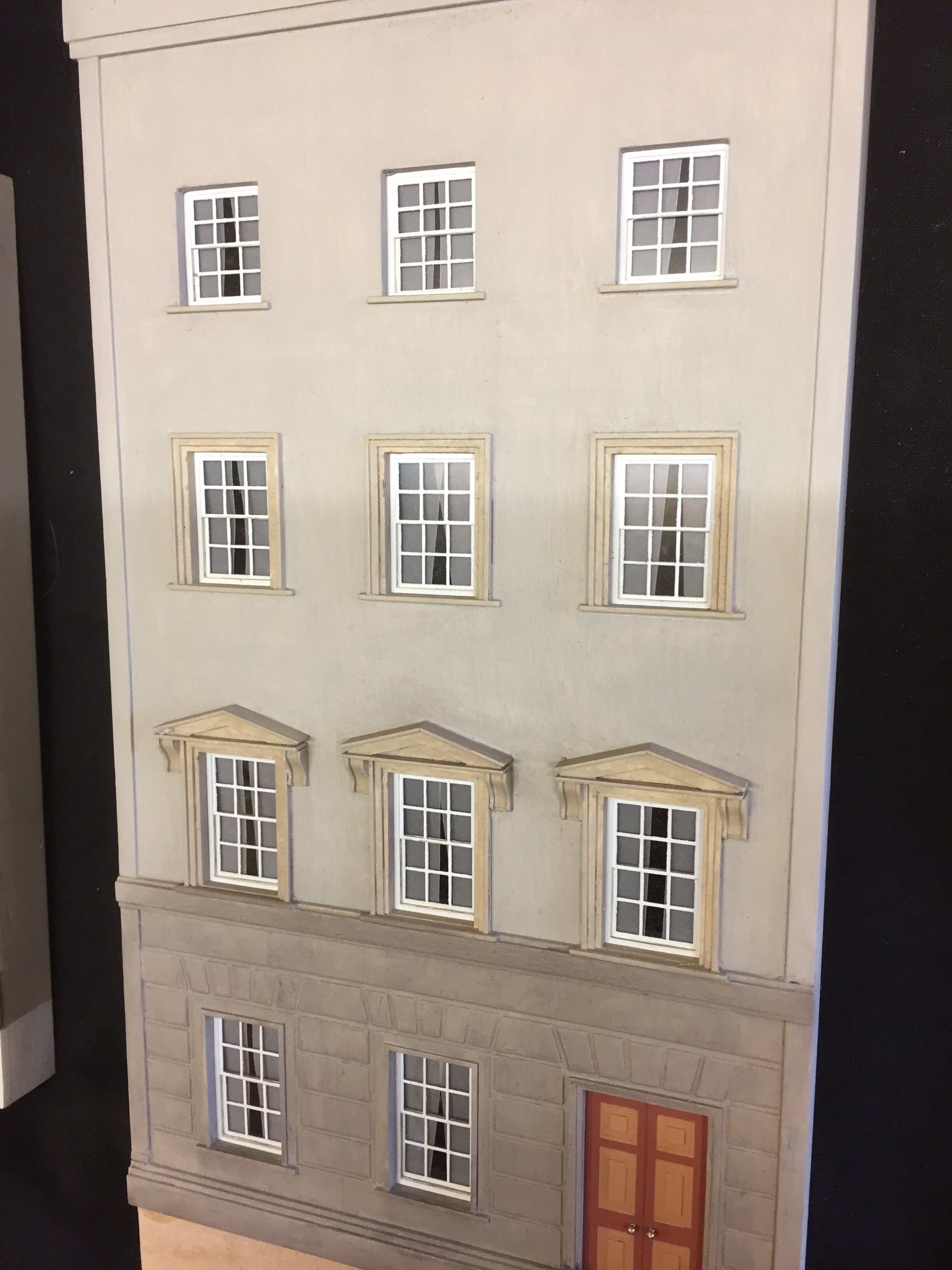
The main structure is my favoured 3mm MDF, laser cut to overall sizes, including door and window apertures. It was a bit complicated to get my head around the various positions (relative to one another) of the door frames, columns, corbels and other main ground-floor architectural details. But once I had the main walls physically in front of me then building up the ‘layers’ of the building structure seemed to flow quite nicely. The upper-storey window mouldings are built up using various thicknesses of ply and MDF, laser cut to size and fitted in place. The windows themselves are thick paper and clear acrylic, again laser cut. The ‘woodwork’ being sprayed white before assembly and final positioning in their recesses. The railings were left over from another project and were my first attempt as producing artwork for a commercial etcher to etc for me. It just so happened that they are a perfect fit for this project too.
The ground floor details are again made using laser-cut parts of thick paper, mountboard and ply, built up around the main 3mm MDF wall as a foundation layer. All details are scratch built, apart from the corbels and columns which are proprietary white-metal castings.
Painting of the model uses Halfords primer. The main wall painted in enamels in two Portland Stone-looking shades to represent the rendered wall surfaces, finished off with a subtle dark grey wash (mostly wiped off) to tone it all down. Woodwork on the doors and door frames uses GWR Stone 1 and 3 from Precision Paints. The marbling on the columns causes some comment and is produced by first painting the columns with a brick-red brown enamel. The veining is done using a very sharp white water-colour pencil, with a photo of real marbling to hand to copy, and detailed with a little grey and brown pencil. Lastly a thinned coat of oil-based satin varnish with a drop of Precision Paints ‘Weathered Wood’ was lightly brushed over and allowed to dry. We weren’t too sure about the prototype usage of gold paint to pick out details at the base and tops of the columns but it was impossible to resist not doing so. I think it looks right anyway!
The sign-written glazing was produced by first drawing the lettering and blue background in AutoCAD and then printing onto ordinary paper. This was given a couple of coats of cellulose lacquer and allowed to dry. Then, one last generous coat of lacquer was sprayed onto the paper surface and while wet, laid an oversize piece of acrylic glazing onto the paper. If the lacquer is generous enough then capillary action takes over and the glazing sticks to the paper with no bubbles. Leave alone until well and truly dry as any disturbance could smudge the printer ink. Once dry, trim to size and fit.
The large Receiving Office and Great Western sign boards were again first drawn in AutoCAD and then the lettering cut into the surface of 3mm MDF with a very light scored line. The boards were then primed and painted with a rich red-brown. The lettering itself was picked out with gold paint and a very fine brush, using the scored lines as guides. The paint tends to not go over the lines, although some touching-in was necessary. The same dirty thinned varnish was lastly lightly brushed over the surface.
The finished model was ‘planted’ against the side wall of the diorama. The road is cobbled and is a sheet of mountboard with individual scribed cobbles. Once the building was stuck down onto this surface, the paths were cut and painted and then stuck up to the edge of the building, so that it doesn’t have any unsightly gaps around the base. The finished effect is rather pleasing. Whilst the layout of the diorama doesn’t allow a face-on uninterrupted view of the Office, tantalising glimpses are possible looking down the road and through arches. I quite like this; because the viewer’s gaze is caught by something round a corner or partly obscured by foreground detail, it invites closer inspection.


